
McLaren reveals updated logo to mark ‘beginning of new chapter’

British supercar manufacturer will extend the new logo across Automotive and Racing sectors.
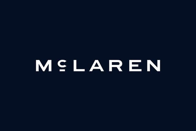
McLaren has updated its logo to mark the ‘beginning of a new chapter’.
This ‘evolved brand identity’ will be used across the brand’s Automotive and Racing segments, allowing it to bring ‘one connected expression’ through various parts of the business.
McLaren will retain its iconic ‘Speedmark’ logo alongside the new typeface, and keep the eye-catching Papaya colour used across the brand’s Formula 1 cars. The ‘Speedy Kiwi’ logo – which honours founder Bruce McLaren’s New Zealand home – will remain as well.
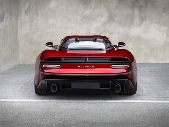
The upcoming McL 6GT will be one of the first cars to wear the new lettering, and it’s expected to appear on the Racing team’s cars shortly as well.
David Woodhouse, chief creative officer, McLaren Automotive, said: There is something uniquely special about McLaren. Throughout our history, we’ve never been content to follow established paths. We’ve always looked ahead, driven by a restless desire to innovate, create and push beyond expectations.

“This evolution of our visual identity captures that spirit. It’s a reflection of the journey we are on as a company. It marks the beginning of a new chapter for McLaren, giving a physical expression to the ambition, creativity and forward momentum that is shaping our future.”
McLaren recently announced plans to expand its UK manufacturing presence through a £500m investment programme that will see it launch its first SUV in a bid to expand its passenger car range.