
Lotus reveals rebrand with new logo for the first time since 1989
British sports car firm ‘simplifies and adds lightness’ to its iconic logo
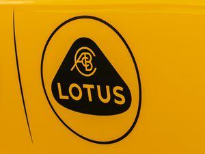
Lotus has taken its ethos of ‘simplify and add lightness’ to a new level by introducing an overhauled logo.
Changed distinctly for the first time since 1989, the Norfolk-based firm’s new logo takes the iconic 3D roundel that’s been in use for three decades and gives it a more simplified look.
The 3D effect and silver accenting has been removed, with the logo now flat in its design — with a British Racing Green design on top of a yellow background. The ‘Lotus’ text has also seen a change in font while also being spaced out further for a more distinctive look.
One thing that does remain is the ‘ACBC’ symbol up top, a nod to company founder Anthony Colin Bruce Chapman. A simpler font is also used here, however.
The badge is being rolled out instantly across the Lotus range, with the first all-new car to wear the logo likely to be the all-electric Evija hypercar, which is set to enter production next year.
Simon Clare, executive director of global marketing at Lotus, said: “We’ve looked back at the original Lotus roundel and thought about Colin Chapman’s philosophy – to simplify and add lightness.

“We’ve applied that to create a new roundel, taking the weight out of the lettering and adapting the spacing. We’ve also straightened the word ‘Lotus’ so it’s consistent with the Lotus wordmark.”
The reveal of the new logo coincides with the announcement of a new sponsorship deal Lotus has signed with newly-promoted Premier League football club Norwich City. This new agreement sees Norwich City’s training facility and youth academy rebranded as The Lotus Training Centre and The Lotus Academy respectively.